Thank you Malini Chakrabarty for creating the beautiful logo for It’s Material!
I was looking for a design that would reflect the essence of It’s Material – building transformative connections – and stand the test of time.
The design brief began with a quote from one of my favorite books, Italo Calvino’s Invisible Cities:
“Marco Polo describes a bridge, stone by stone.
‘But which is the stone that supports the bridge?’ Kublai Khan asks.
‘The bridge is not supported by one stone or another,’ Marco answers, ‘but by the line of the arch that they form.’
Kublai Khan remains silent, reflecting. Then he adds: ‘Why do you speak to me of the stones? It is only the arch that matters to me.’
Polo answers: ‘Without stones there is no arch.”― Italo Calvino, Invisible Cities
The quote captures the way in which something strong like a bridge is a culmination of the people who conceived, designed and built it, and of the materials with which it is made. The same goes for processes, projects, and organizations.
The shape
Designing from that quote, Malini began with shapes based on arches and bridges. Yet through a 23-sketch flow on a single page she landed on the image of a triangle, composed of different shapes (echoing the “crazy paving” image in the header of It’s Material newsletters).
Surprising myself somewhat, I knew immediately that was the shape to choose. It’s strong, and has a clear sense of direction, building on a collective base. The three corners reflect the three inter-connected approaches It’s Material brings – connection, creative communication and practical strategy for social, environmental and economic change.
It brings to mind the pyramids of course, with the vision and labor that went into them, their linkages between past, present and the future, between the material and the spiritual. And while an upwards triangle is traditionally perceived as masculine – with connotations of “conquering” mountains, of power as per triangular-logo-ed brands like Mitsubishi, adidas, CAT, I thought hell yeah, all the more reason to adopt it, and bring in the feminine, and feminist.
The colors
I surprised myself again when I suggested we include purple, as well as our initial color combination of orange and green. Malini shared back a crocus-inspired color pallet to work from:

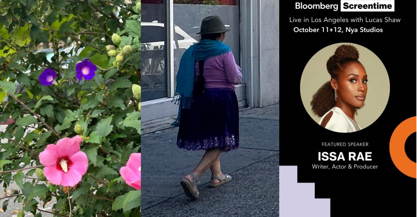
As we thought about colors I found myself navigating streets by color. Fashion, flowers, billboards and posters with these colors served as inspirational reinforcement of the direction in which we were headed.
For someone who gravitates to words more than design it was a reminder of the language of color. It happens that the logo’s final colors have wonderful names, too: Tangerine, Matt Purple, Blackberry Cordial and Mermaid’s Kiss.
We carried out the logo design project through a compressed and inspiring series of four conversations this Summer. As we wrapped the project up, Malini said she looks forward to seeing the ways the new logo and branding are put to use. I do too.
